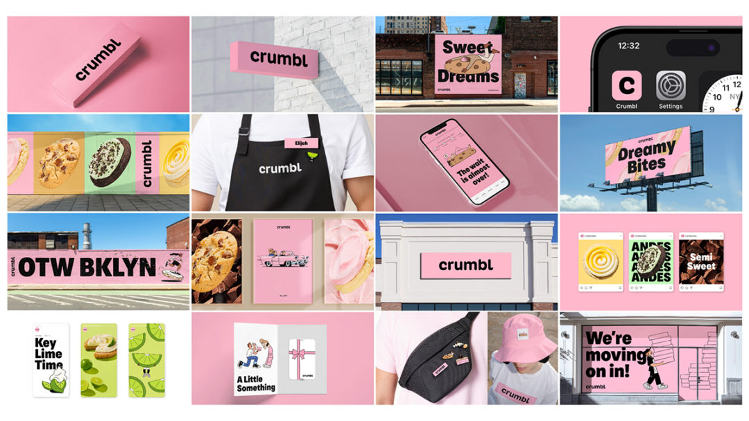
Crumbl is providing a new take on its brand marking six years of growth from a local cookie shop to a franchise with over 950 locations across the US, Puerto Rico and Canada.
In a strategic move to stay current and connect with its audience, Crumbl has introduced subtle yet impactful changes to its branding, including vibrant colors, sleeker packaging and reimagined icons, emphasizing the importance of detail in the overall customer experience.
More specifically, Crumbl is letting the Bakerhead logo go as well as the word “Cookies.” To capture the playful tone of the brand, Crumbl created its own new font and completely embraced the Pantone Crumbl Pink created earlier this year, a more deep yet bright look for the brand.
“I’m pleased to share that Crumbl Cookies is undergoing a brand refresh in the coming months/year,” says Sawyer Hemsley, co-founder and chief branding officer at Crumbl. “This is not a complete rebrand, but rather enhancements to the brand we’ve built a solid foundation upon. The purpose is to infuse new life and energy into Crumbl while maintaining our core values.”
The refresh kicked off with an updated app icon and social media profile pictures, a few social media posts and an official announcement from Hemsley paired with a sneak-peek video that covers the details of the refresh.
“The changes are a deliberate effort to keep our brand relevant,” Hemsley says. “Our focus is on evolving without losing the essence of what Crumbl stands for.”